* swap'd
* swap'd
a campaign aimed at college students to encourage swapping from single-use items to reusable ones
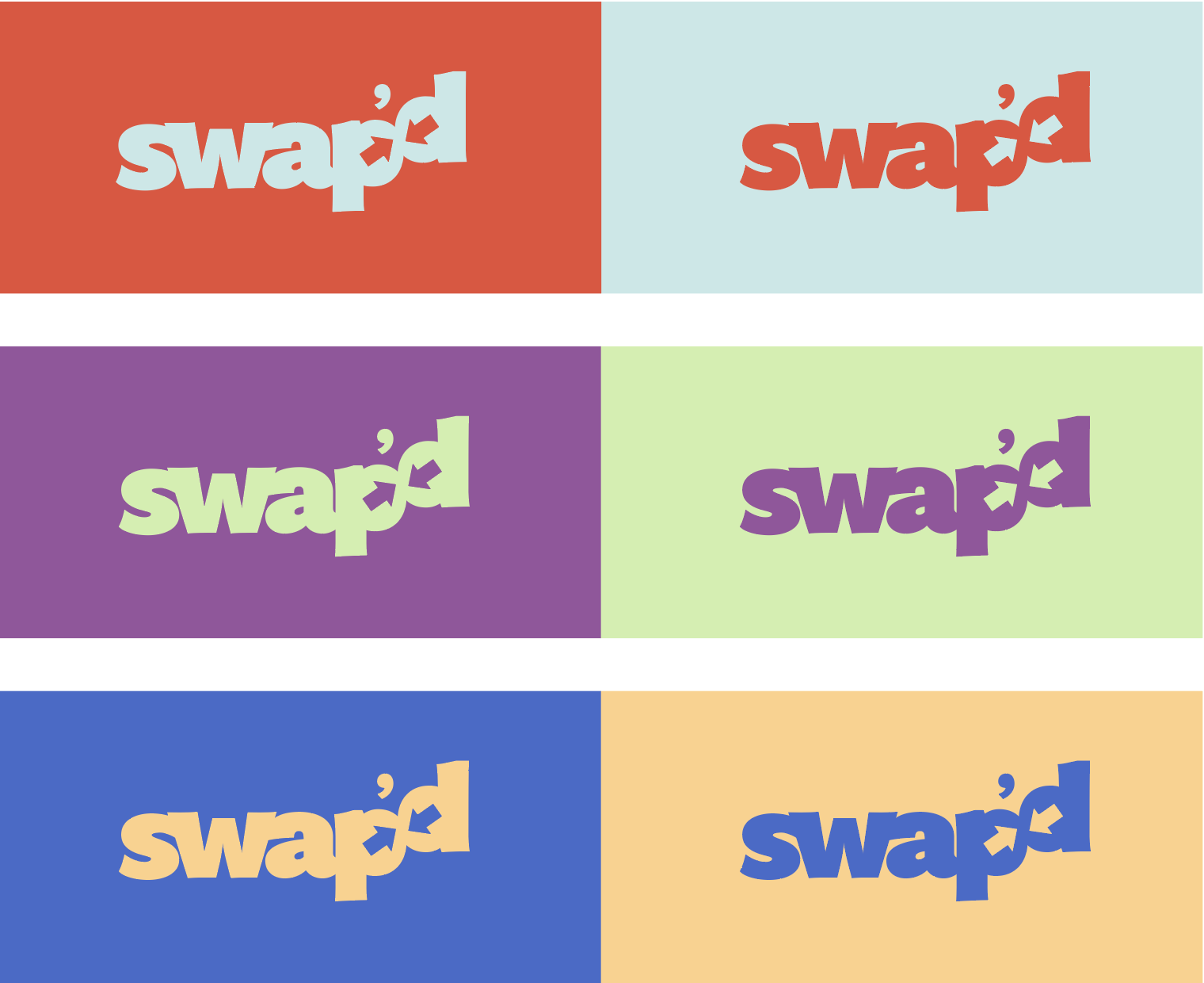
the logo
the design process
This heavy, bold font has a strong sense of legibility while still packing a heavy element of color.
Two arrows, respectively placed in the ‘p’ and ‘d’ convey a sense of switching or trading, embodying the campaign’s main mission.
The two arrows also become the brand’s icon for more graphic applications and uses.

The name swap’d gives the brand high visibility, as it’s a fast and easy action word that’s also fun to say.
The graphic identity of swap’d wears a contrasting pastel-bright color palette to grab the eyes of busy students. The logo colors are strategically paired with one another to create the eye-popping color contrast.
The logo also includes the tagline “make one switch to get” which reiterates the simplicity of making the change.
the brand
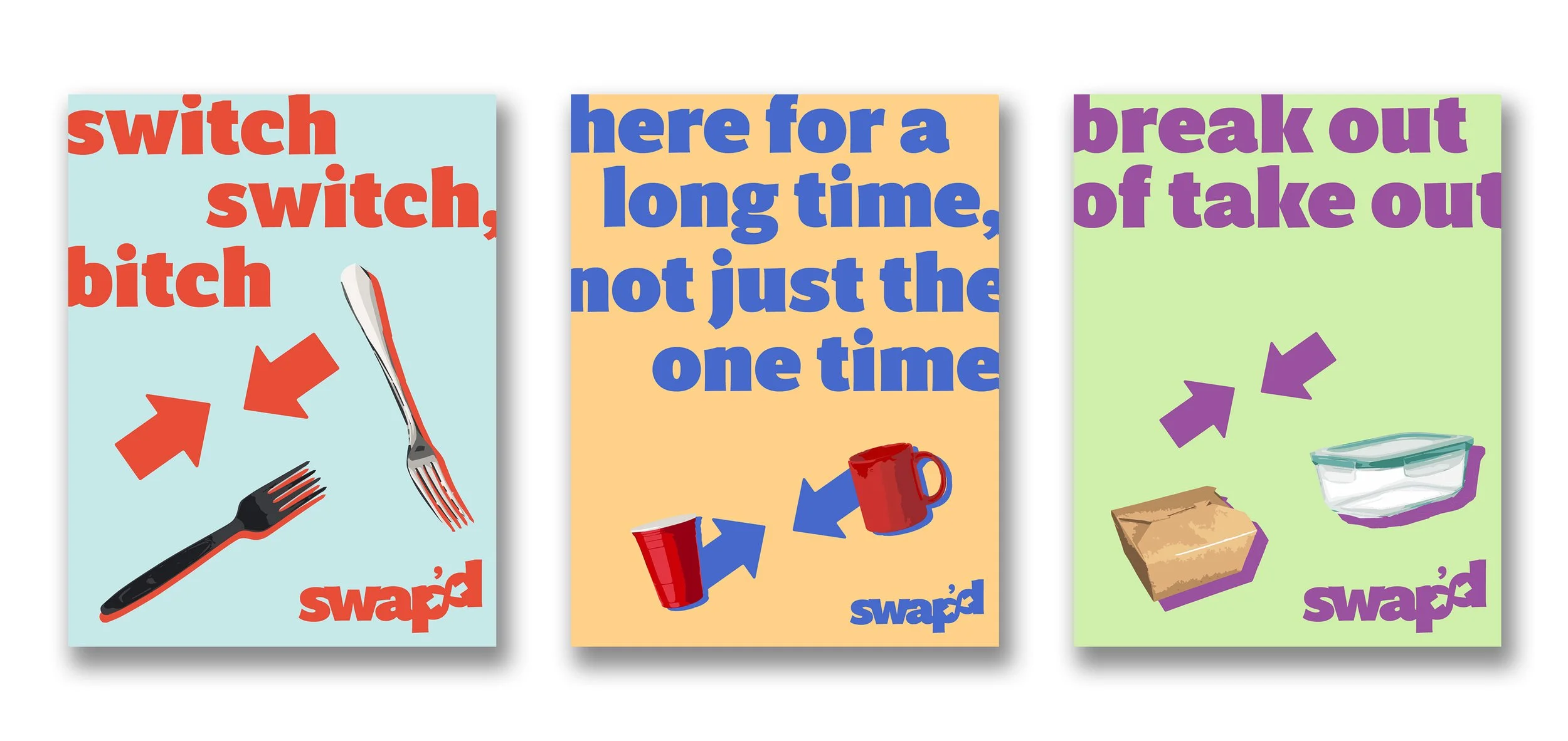
swap’d utilizes posters, flyers, and promotional items to reach out to students to get them to participate in the campaign.
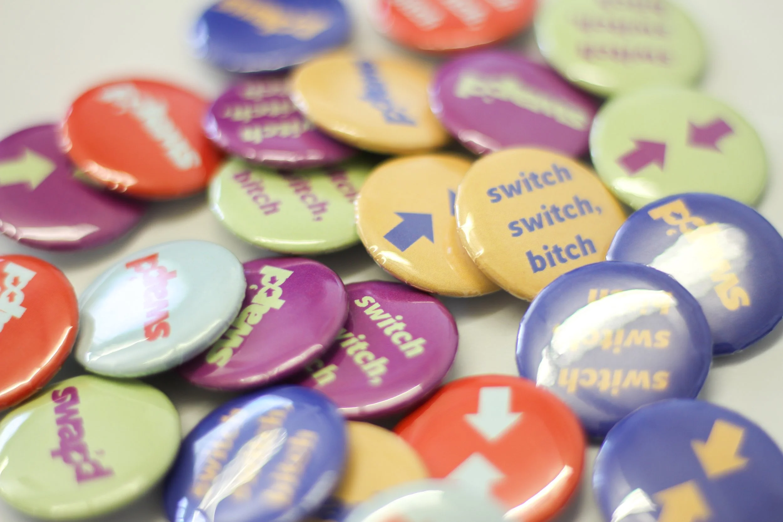
To spread the word, swap’d gives out t-shirts, canvas tote bags, and button pins as promotional items. During outreach events, flyers, which have tips about easy swaps and discount codes for sustainable products, are handed out.
the application

* the campaign rollout
* the campaign rollout
the writing’s on the walls
College campuses are decorated with heaps of flyers, posters, and signs. It’s hard to get someone to stop and read, even if it’s for a few seconds.
Filtering through walls of words is tough for an on-the-go student, which may be a huge factor as to why a campaign’s message can’t get across to its audiences.
How do we get college students to follow another initiative to practice sustainability on campus?

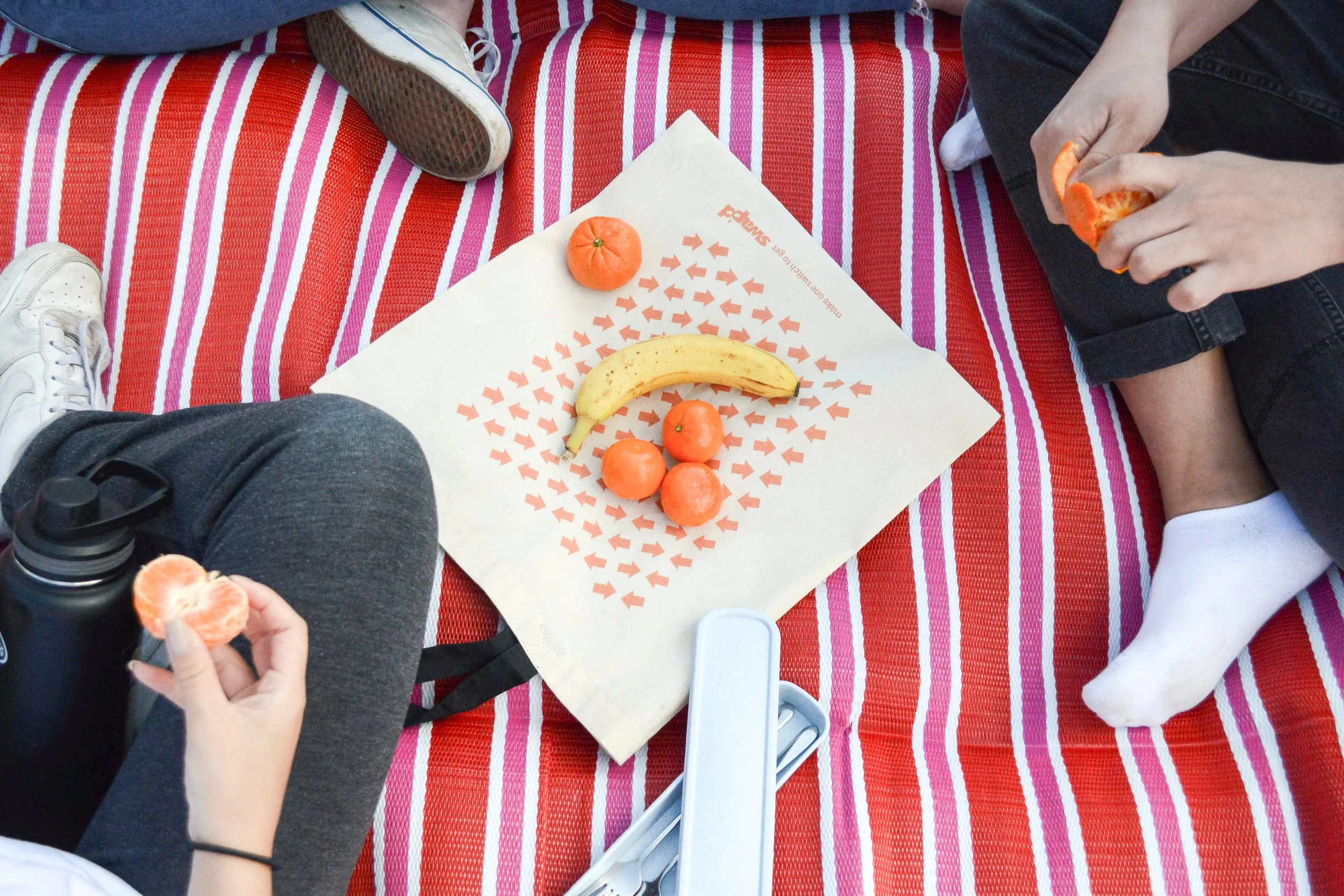

swap’d is a campus initiative that educates students about sustainable habits. The goal of the campaign is to encourage and empower students to take small steps towards sustainability, starting with the swapping out their single-use items for reusable ones.
While similar plastic-free campaigns exist on campus, they all fall short due to a lack of visibility and participation. swap’d empowers individuals to recognize and claim ownership of their single-use waste habits in order to make a real impact.
a stand-out message
addressing your audience
While designing this campaign, it’s important that the audience remains at the front of all design decisions made.
College students are typically very busy people with very little capacity to pay attention to something that isn’t already on their minds. It is crucial that the design stands out from the rest, both visually and experientially.
making the swap
The main messages swap’d communicates is the simplicity of making the switch. Bringing reusable utensils, such as the forks and spoons used at home, eliminates the need for disposable ones someone might get from the cafeteria at school.
For the best chances of visibility and participation, swap’d brought the “swaps” directly to students in the form of flyers, signs, and merchandise.

